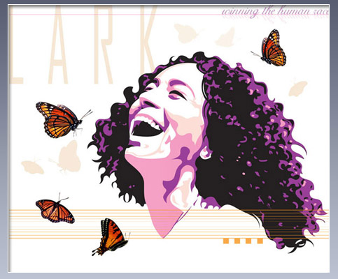
Vector art in Illustrator
Layout in Photoshop
On the list of stuff I'm super proud of, this is definitely right up around number one. I smile every time I look at it. I'd like to mention, I won an award for Vector Art back in college. You know. When dinosaurs roamed the earth and cell phones were the size of toasters.
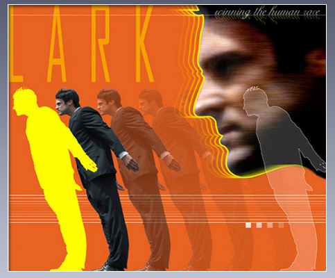
Vector art in Illustrator
Layout in Photoshop
Another artwork from the Lark project. I like it, just not as much. It makes me feel like I'm frantic, stuck in traffic, early in the morning, before coffee. Ah, Zip Zoom.
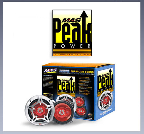
Package and logo design, Photoshop, Illustrator
Package design can be fun. Here's a good one. Automotive industry art with bright colors, bordering on clashing, but somehow working together.
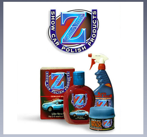
Package and logo design, Photoshop, Illustrator
More automotive industry package design, both boxes and labels. The challenge here was the variety involved. The client wanted a logo that is instantly recognizable, plus USA colors without being overly patriotic. Some seriously tight deadlines were involved.
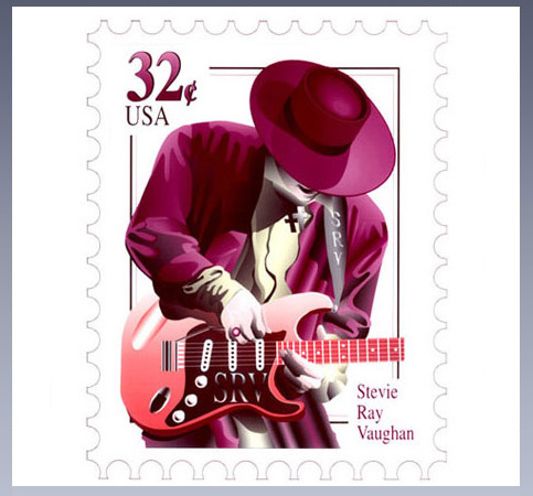
Vector art in Illustrator
Layout in Photoshop
Interesting factoid: you have to be dead to be on a postage stamp. I was a huge fan of Stevie Ray Vaughn, and very sad when he lost his life. I put some feeling and effort into this piece. This is the vector art I won the award for.
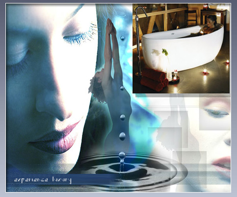
PRICY BATHTUBS
Layout and design, InDesign, Photoshop, Illustrator
The client wanted something "out of the ordinary". We decided to focus on the sensuality of bathing rather than just show a bunch of bathrooms. The beauty of their products speak for themselves. The layout seeks to embellish it.
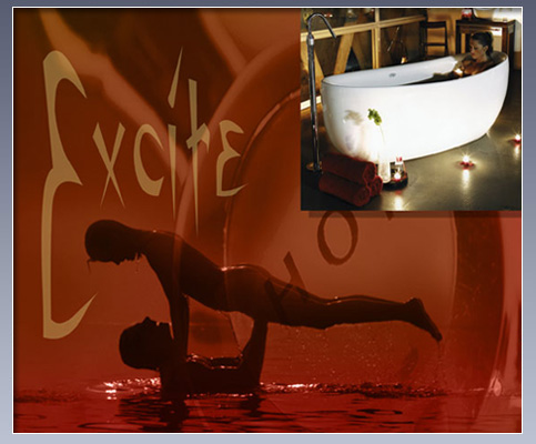
PRICY BATHTUBS
Layout and design, InDesign, Photoshop, Illustrator
The bathtub guys absolutely loved this one. They found it very sensual, playful and exciting. I did some very fancy layering and colors. It was a fun time.
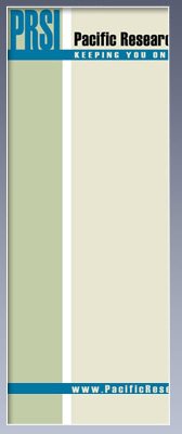
FOR PRSILayout and design, InDesign, Photoshop, Illustrator
This client was completely open to any and all layout ideas, with very few demands regarding colors and fonts. I offered several very different looks. I think they chose the first one, can't quite remember.
CLICK SLICES TO VIEW >>