Layout, design, Joomla,
CSS, digital painting
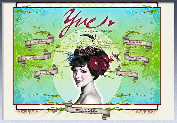
I worked very closely with Yve to achieve a look and feel that best reflects her very unique work. The splash page is a highly stylized digital painting. The interior has lightbox galleries, a blog, and a calendar of events. The back end has a newsletter system that allows Yve to keep in touch with hundreds of contacts, and a registration system to acquire new contacts.
Layout, design, Joomla,
CSS, logo design
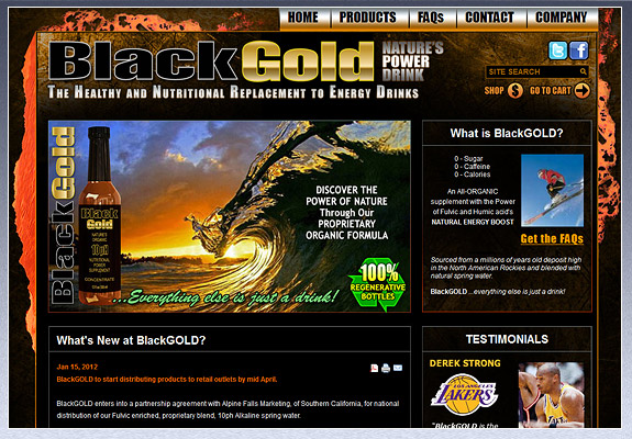
I'm super proud of this website and to be working with the folks at BlackGOLD. As an up-and-coming contender in the highly competitive sports drink industry, BlackGOLD needed a sporty but healthy edge to their website, and plenty of fast-loading functionality for a steady flow of fresh content.
Layout, design, XHTML,
CSS, logo design, copywriting
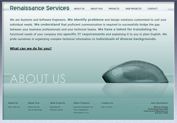
When I'm asked to help a colleague with their business website, it's something of an honor. It means someone who has experience working directly with me thinks I'm good enough to do their stuff too. I like that. This gentleman is the best back-end developer in the known universe. Need some high-end, custom applications? Contact him here.
Layout, design
XHTML, CSS
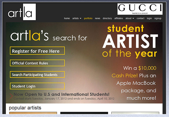
The challenge of this project was to take layouts done by excellent artists and translate them for the web. This client represents some of the finest artists in the world, so attention to detail was paramount.
Layout, design, Wordpress,
CSS, logo design
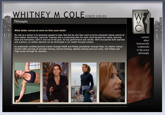
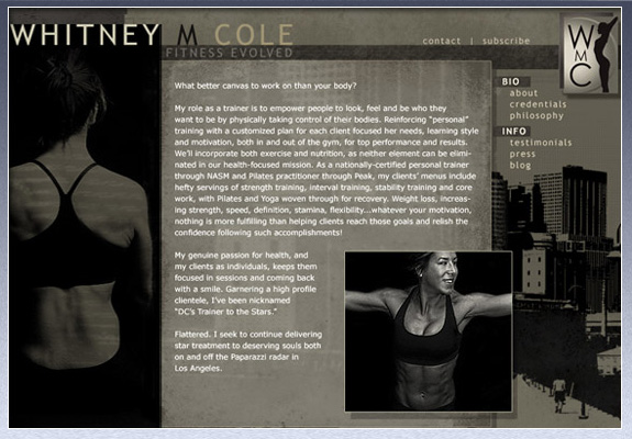
Ms Whitney M Cole needed a mixture of style, class, urban hipness, and really ridiculously buff body parts. We did a lot of back and forth to try to really capture her strength and personality. Designing her website was fun, challenging, and made me feel very fat.
Layout, design, Wordpress,
CSS, logo design
This design was voted out, but did come in a close second. I'm really pleased with it, so here it is as an Honorable Mention.
Layout, design, Wordpress,
CSS, logo design
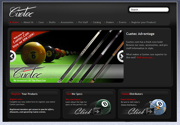
The Cuetec folks were beyond pleased with this complex, high-end website with tons of visual impact. In addition to customized modules such as a store locator and product registration, the site features an interactive flip-thru catalog, and a very nice flash intro.
Layout, design, XHTML,
CSS, digital painting
Kerry White is some sort of brilliant, but not for the faint of heart. The police have been called to his shows more than once. He needed a gritty site to match his abrasive style, I built him a back alley, New Orleans, speakeasy vibe.
TRANSPORTATION
Layout, design, XHTML,
CSS, logo design, Flash
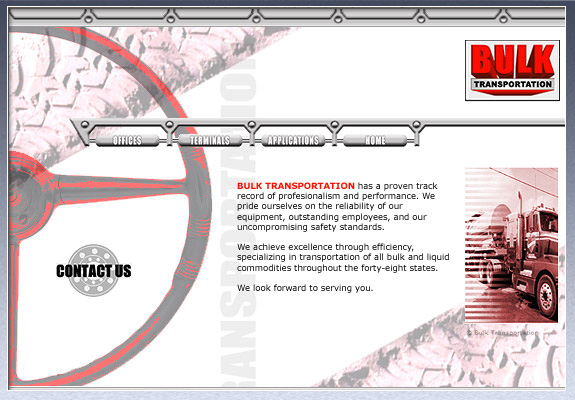
Bulk didn't have much to say, but you can't be minimalistic with a trucking company. It ain't vogue. I tried to give Bulk a big burly feel to their small amount of content without letting things get too busy.
CSS, logo design, Flash
This educational website won the Award Of Excellence from the Public Relations Society of America. I'm rather proud of that.

CSS, logo design, Flash
Building this clean-cut website required that I learn and evaluate their software, then translate it in a way visitors could easily understand. A look at the masthead animation can be found in my Flash gallery.
CSS, logo design, 3D Studio
This client's clients require high-end network security. We needed a look that inspired confidence, but wasn't too cold and corporate. Some Matrix-esque 3D art helped things along. The interior is somewhat boring, so here's the splash page.
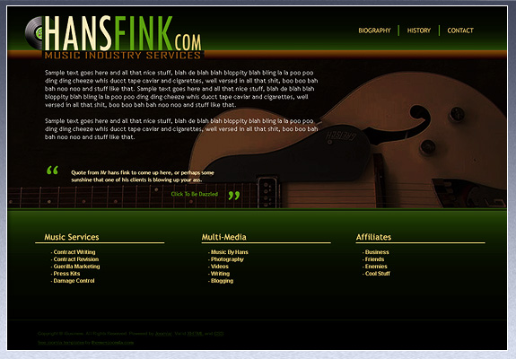
CSS, logo design
Hans Fink needed a website that was music industry oriented, without being genre-specific. It wasn't easy. After several layouts, he chose one that I don't like. Here's my favorite. It's way foxy.